Fill your bowl to the brim and it will spill. Keep sharpening your knife and it will blunt. Chase after money and security and your heart will never unclench. Care about people’s approval and you will be their prisoner. Do your work, then step back. The only path to serenity.
– Tao Te Ching
It is not the consciousness of men that determines their being, but, on the contrary, their social being that determines their consciousness.
– Karl Marx
Keep away from people who try to belittle your ambitions. Small people always do that, the really great make you feel great too
– Mark Twain
The Most Important Chart in the World
Back in my Bernstein days, I never really took a large amount of presentation materials to most of my meetings. However, there was one chart that I always printed out and brought with me and I called it “The Most Important Chart in the World.” It still is. The chart I am referring to is the ratio of the Dow Jones Industrial Average: The Gold Price. In a nutshell, charting this ratio demonstrates the “real” return on stocks adjusted for inflation or currency debasement. As we all know, the Zimbabwe stock market essentially went up to infinity during their hyperinflation but did anyone get rich from that? Of course not, the shares were denominated in a currency that was on its way to worthlessness. At the moment, with many U.S. stock indices hitting new post-2008 highs there seems to be a general view that stocks as an asset class will do well in an inflationary environment. As a result, whenever there is actually QE or even the mention of the potential resumption of Fed balance sheet expansion there is a rally in equity prices. In fact, I think the entire investor class in the U.S. has been lulled into a sense of sleep and complacency at the moment. There are two things I want to point out to people when they are considering whether to increase exposure to equities broadly or not.
1. Allocation of Portfolios from the BRICS and Europe: When you look at how well U.S. Treasuries and German Bunds have done this year, it becomes pretty clear that investors have shifted massive amounts of bond capital away from the formerly high growing areas of the world (that are now in serious collapse) into those nations perceived as “safe havens.” While Germany doesn’t have its own currency, the U.S. obviously does and given concerns surrounding a Euro breakup and the extreme difficulties in the Chinese and Indian economies, many investors have decided the dollar is the best house in a bad neighborhood, at least temporarily. This has led to a flight to U.S. equities generally, but also specifically into large cap U.S. centric names with dividends. This is THE crowded trade of 2012 and three prime examples are Wal-Mart (WMT, +22% YTD), Target (TGT, +26% YTD), and Home Depot (HD, +36% YTD). If you ask me, this trade is extremely long in the tooth.
2. Strong Performance Concentrated in a Few Stocks: I have hit on this theme many times before, but the key point is that if you weren’t in the right names this year there is a good chance you have underperformed the market significantly. While you can say that this is normally the case, this year has been far more extreme as is evidenced by reports of horrible hedge fund performance this year relative to the benchmarks. Apple (AAPL), of course, is the prime example. This giant now sports a market cap of $623 billion and is up 65% YTD.
An Inflation Hedge?
The point I am attempting to make above is that those are the two main reasons for U.S. stock outperformance this year. More than anything else, it has been about reallocation of global portfolios away from former high flying regions into those regions that are deemed safer. I believe this has been exacerbated by the fact that the relative performance of the U.S. economy versus the BRICs caught a lot of people off guard. That being said, I also think that the complacency that exists today is partly a function of investors’ belief that stocks will provide a good hedge against rising inflation and so why sell. After all, if the Bernank is going to print at the first sign of weakness I should be sitting pretty with my stocks. However, is this a correct train of thought?
My view, and one that was borne out in the last big inflationary period in the 1970s, is that high inflation is not good for stocks. Not even in nominal terms. PE ratios shrink as there is little real investment, confidence is shattered and the outlook becomes cloudy. Some companies have pricing power but many do not.
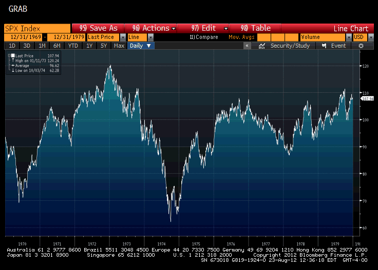
Here is the chart of the SPX from 1970-1980.
See that. Nothing done. That’s ten years of zero, but with some really nice tradable swings. The reason I bring all this up now is because we are likely to see a significant upswing in inflation as we head into 4Q. Gasoline prices have been on a tear as of late and are now showing +9% on a year-over-year basis. Recall that prices at the pump only adjust with a lag, so this will be impacting people for weeks to come. The bigger issue though will be food. Largely as a result of the severe drought in the U.S., corn and wheat prices have jumped 50% in the past two months. This will affect consumption one way or the other. The reason I am really concerned with the food situation is that the lag on passing on that is even longer, so we really haven’t seen any of it yet. Furthermore, consumer product and food companies have already utilized almost every trick in the book up until this point. Shrinking package sizes, putting less in the same packages, etc. So I envision a scenario coming where the food inflation will be much more overt and in your face and this will further depress psychology. Particularly amongst the newest members of the food stamp club, who were formally part of the vanishing middle class.
So to me, stocks broadly will not provide the protection assumed by many at the end of the day. The only way I could see it happening is if we totally destroy the value of the currency (very possible, but I do not see evidence of that trade being in effect yet). There is one major component missing to the “dollar becoming worthless” event. One way it could happen would be an outside force dumping dollars (treasuries) aggressively without regard for price. The second, and more likely scenario, would be a further expansion of the Fed’s balance sheet (QE) but this time directed at the public at large. The key thing so far has been that the Fed’s actions have really only benefitted speculators as they have borrowed cheaply and purchased assets (hence the rally in markets). The real inflation will come once the money is handed out at the street level. This may be coming and if it does, I don’t suspect the names that have benefited so far this year will be the stocks to be in. Yield chasing will be shunned and inflation protection investing will be en vogue. I would start to prepare for this eventuality.
Back to The Most Important Chart in the World
Sorry, got a little sidetracked there. So, the key thing with the Dow/Gold chart is that it perfectly mimics the various social moods and massive secular trends that exist in the economy over very long periods of time. It is just as effective in periods of deflation as in inflation in telling you the true story. Let’s take a closer look and examine what it has looked like from 1920-Present.
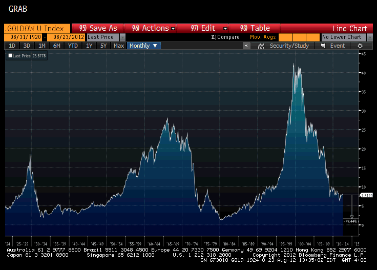
Monthly Chart of DOW/Gold 1920-Present
What this chart shows you are secular swings in the economy. You see how stocks ran up in real terms into the 1929 crash and then plunged versus gold. You see how they ran up in the next great post- WW2 period into 1968 when they once again plunged versus gold. Then you can see the great secular bull market in stocks from around 1982 to the bubble peak in 2000. In both of the prior two periods (one deflationary and one inflationary) the DOW/GOLD ratio got down to about 1:1. It has been my contention for many years that we will see that same ratio once again. That would imply another roughly 80% drop in stocks to gold and I expect that this next leg is beginning now.
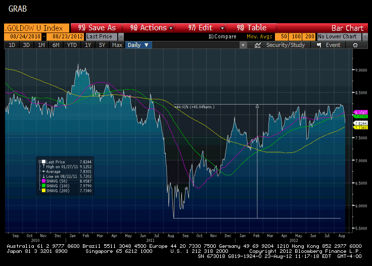
Dow/Gold Two Year Chart
Of course for active investors and traders, timing is important and you can have massive counter trend rallies within a larger, secular trend. I believe we have just completed one of those. As you can see in the chart below, the Dow/Gold ratio has just had a massive 44% rally in past year or so, but it looks as if it may have formed a serious top. Incredibly, it is one of the biggest counter-trend rallies of the entire secular bear period for stocks since 2000, registering at around 44%. While very painful for those who didn’t see it coming, it is no coincidence that it happened in an election year. My sense is this chart is currently in reversal mode and I think the ratio could hit between 4-5 from the current 7.8 over the next 12-18 months. That is a huge opportunity if I am correct. As always, decide for yourself.
Back in Colorado
In case you are only on this email list and haven’t seen anything from me in a while, it is because I was traveling and also focusing on my blog: http://libertyblitzkrieg.com/ where I have been posting daily. If you haven’t signed up to get the blog updates via email, it is very easy to do so on the right sidebar. Also, I have started using twitter actively and I find it extremely effective. You can also follow me through twitter on the right sidebar or just find me @libertyblitz
Until next time.
In Peace and Wisdom,
Mike
Donate bitcoins: 35DBUbbAQHTqbDaAc5mAaN6BqwA2AxuE7G
Follow me on Twitter.


Sorry, the most important chart in the world is embedded in this article
http://lithiumcafe.blogspot.gr/2012/08/greece-ready-to-start-selling-islands.html
The perfect set up will be apple going Into the DoW in a blow off top type trade. Apple into the Dow at $800b market cap !!! Then Faceplant and viola gld dow ratio screams to 1. Wake up when we get there
this is the misnomer of the day : “middle class disappearing” streach out a rope and “disapear” the center what do you have? TWO ropes both with a middle or center I.E. the ‘center ‘ IS the rope. at the end of the day we are a rope and the center IS the population and NO matter the income level it remains the “middle class” what IS hapening is COMPRESSION and the resulting presures WILL find outlets eventualy ant that will be revoloution and the middle class will be the center of it as it always has been see the LIE is that the us INVENTED the middle class wich when you relize the dynamic i outlined at the top is LOGLICLY impossable the founders of this country and the first emegrents were ALL the middle classes of ALL of europ who had been disenfranchized in there home countries by the advent of scocialisim wich goes clear back to the english civil wars and was started by the machinations of the house of york under the influence of the mainland banks that were financing there pogrom against the house of lancaster the direct result of wich was the imposition of parliment as the ruling body of england by cromwell and the flight of the english middle class to america folowed closly by the french and then en mass from all over europ
Almost all trading is done automatically by omputer , literally, via algorithms that are set at the whimsy of their oligarch masters….,this plug gets pulled when they want to pull it. Black hats and white hats want to both crash this scheme along with the primary issue of the fiat monetary scheme….so it will crash. Only question is which hat color chooses the post crash system.
Ok…for the ignorant among us (I of course am referring to myself…) can you interpret this chart for us? I get that there have been huge swings but how do you interpret this right now?